How to Make On-Brand AI Images With Your Logo, Colors and Fonts
 ReelyArtTutorials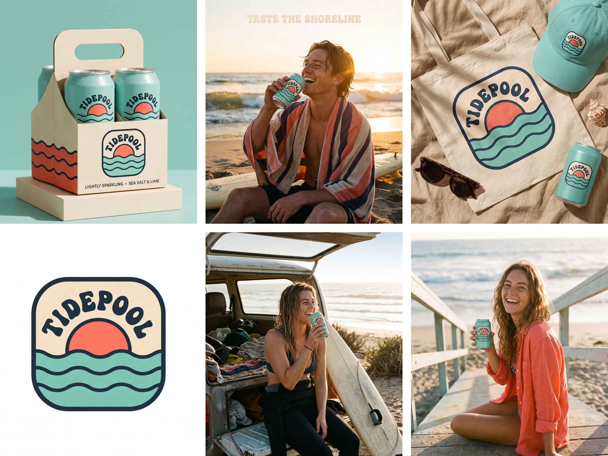
Key takeaways
- Attach the logo as the first reference image and tell the model to use it exactly as it is; describing a logo in words produces a new logo each time.
- A fixed brand paragraph with hex colors, type, logo rules and mood, pasted at the top of every prompt, keeps a whole kit consistent while only the scene changes.
- A one-page brand board as the second reference carries the typeface, which is hard to describe in words.
- Anything shown on the brand board can leak into later images: the board's can said "sparkling water", and four cans copied it until one sentence banned extra text on the can.
- Ads need art direction as well as brand rules; the same colors looked like clip art until the prompt described a photographed campaign.
On this page
To get on-brand images from an AI model, describe the brand once in a fixed paragraph and attach two images to every prompt: the logo first, a one-page brand board second. We built a full kit this way for TIDEPOOL, a made-up sparkling water brand, with Nano Banana 2.1. It runs from the logo to packaging, merch, a subway poster and social ads, and the badge stayed recognizable in every image.
Every prompt is printed below in full, along with the three things that went wrong and the line that fixed each one.

What makes it work
- The logo is an image, never a description. Describing a logo in words gets you a new logo each time. Attaching it as the first reference and telling the model to "use the logo from the first reference image exactly as it is" kept the badge's outline, sun, waves and lettering on every product.
- One brand paragraph, pasted every time. Name, hex colors with their jobs, type, logo rules and mood sit in one block at the top of every prompt. Only the scene after it changes, so nothing about the brand is left to chance.
- The brand board does the typography. Hex codes pin the colors, but a typeface is hard to describe. A board that shows the type at size gives the model something to copy, and the headlines in the ads came back in it.
- Close every gap that can hold text. A can, a sign or a background is a place the model will write on if you leave it open. Say what goes there, in quotes, and end with "No other text".
- Art direction is part of the brand. The colors were right in our first ads and they still looked like clip art. A second version of the brand block that describes the photography fixed it (see below).
Step 1: the logo and the brand board
Start with the logo, on its own, on white. Our first logo was three wave lines next to a wordmark, and it looked like a hundred other brands. This badge came from asking for something "distinctive" with a clear era ("1970s surf-style") and a shape ("rounded-square badge").
Distinctive retro coastal badge logo for TIDEPOOL, a sparkling water brand. A rounded-square badge in sand #F4E9D8 with a thick ink #1E2A33 outline: inside, a coral #FF6F59 half sun setting into three seafoam #7FD1C3 wave bands, and the word "TIDEPOOL" arched over the top in a chunky rounded 1970s surf-style typeface in ink. Screen-print flat colors, bold and friendly, no gradients, no shadows, no mockup. Centered on a plain white background with generous space. Only the word TIDEPOOL, no other text.
Then the board. It takes the logo as its only reference. It lays out what every later image needs: the colors with their codes, the typeface at size, the symbol on its own and a product photo.

Using the logo in the reference image exactly as it is, create a one-page brand identity board for TIDEPOOL, a sparkling water brand. A clean grid layout on a sand #F4E9D8 background: the logo large at the top left; four rounded color swatches labeled "Seafoam #7FD1C3", "Coral #FF6F59", "Sand #F4E9D8" and "Ink #1E2A33"; a type sample showing "Aa" and "TASTE THE SHORELINE" in the same chunky rounded 1970s surf-style typeface as the logo; the sun-and-waves symbol alone, without the word, on a seafoam tile; and a small photo tile of a seafoam aluminum can lying on a striped beach towel. Flat, modern, minimal presentation, like a design studio's brand guidelines page. No other text.
Step 2: the brand block
This is the paragraph that opens every mockup prompt below. Copy it, swap in your own name, colors, type and mood, and keep the logo sentence as it is.
Brand: TIDEPOOL, a sparkling water brand from the California coast. Colors: seafoam #7FD1C3 (primary), coral #FF6F59 (accent), sand #F4E9D8 (backgrounds), ink #1E2A33 (text and outlines). Type: a chunky, rounded 1970s surf-style typeface in all caps for the wordmark and headlines, a clean simple sans-serif for small text. Logo: use the logo from the first reference image exactly as it is, the rounded-square badge with the coral sun setting into seafoam waves and the arched word TIDEPOOL; never redraw, stretch, recolor or add effects to it. The second reference image is the brand board: follow its colors and type. Mood: relaxed, sunny, coastal and retro, with flat color areas, thick ink outlines and plenty of sand-colored space.
In Studio, attach the logo as image 1 and the board as image 2 in Custom mode, then paste the block and the scene. Nano Banana 2.1 takes up to four reference images on the free plan, so two leaves room for a product photo or a person.
Mockups: packaging, merch and stationery
Each prompt below is the brand block above, followed by this scene text.
Packaging
A 4-pack on a plinth. The carrier line came back in capitals, which suits the brand; if you need the case kept, say "in sentence case".

Product photo of a TIDEPOOL 4-pack: four slim 12 oz aluminum cans in seafoam with a coral wave band, the logo badge printed on each can, held in a recyclable sand-colored paperboard carrier with the logo on the front panel and the line "Lightly sparkling · Sea salt & lime" in small ink text. The pack stands on a pale sand plinth against a seafoam backdrop, soft daylight from the left, a crisp shadow falling to the right, a few water droplets on the cans. Studio product photography, 85mm lens, sharp label details. No other text.
Merch
The badge is screen-printed on the tote and embroidered on the cap, and both read as real materials.

Overhead flat lay of TIDEPOOL merch on a sand-colored linen surface: a natural canvas tote bag with the logo screen-printed large, a seafoam six-panel cap with the logo badge embroidered on the front, a pair of tortoiseshell sunglasses, one seafoam can and a small seashell. Soft late-morning sunlight with palm-leaf shadows falling across the scene. Visible fabric texture, the print and the embroidery look real. Lifestyle product photography. No other text and no other logos. The can shows only the logo badge and nothing else: no words like sparkling water, no volume, no small print anywhere on the can.
Stationery
Business cards, an envelope, a sticker and a letterhead. Asking for "no email addresses, no web addresses" keeps the model from filling the cards with invented contact details.

Stationery mockup for TIDEPOOL on a seafoam paper background: two business cards, one showing the logo on sand and one coral card with "Maya Torres" and "Head of Brand" in small ink text; a sand envelope with the logo badge on the flap; a round coral sticker with the logo badge; and a letterhead sheet with the logo at the top. Arranged in a neat, slightly overlapping grid, soft overhead daylight, gentle shadows, matte paper texture. Clean design-studio presentation. No other text, no email addresses, no web addresses.
Campaign ads: poster, posts and story
The ads use a second block. It keeps the logo and color rules and replaces the type and mood lines with art direction, because these are photographs first.
Brand: TIDEPOOL, a sparkling water brand from the California coast. Colors: seafoam #7FD1C3, coral #FF6F59, sand #F4E9D8, ink #1E2A33. Logo: use the logo from the first reference image exactly as it is, the rounded-square badge with the coral sun setting into seafoam waves and the arched word TIDEPOOL; never redraw, stretch or recolor it. The second reference image is the brand board: follow its colors and typeface. Art direction: a premium, real-world advertising campaign shot by a top photographer, natural light, real materials and textures, restrained typography with lots of breathing room, nothing cartoonish, no flat clip-art illustration. Every can shows only the logo badge, no other words on the cans.
Subway poster
The poster is a photograph inside a photograph: friends on a van roof at golden hour, on a tiled wall with commuters passing. The headline stays small in a corner and the badge sits in the opposite one.

A large TIDEPOOL advertising poster on the white tiled wall of a New York City subway platform. The poster is one full-bleed warm 35mm film photograph: three young friends sitting on the roof of an old van parked on a cliff above the ocean at golden hour, laughing and clinking seafoam and coral cans, surfboards strapped to the roof rack, hair blowing. Only a small headline "SUMMER, CANNED." in the brand typeface in sand color in the poster's top-left corner, and the logo badge small in the bottom-right corner. Commuters blur past in the foreground, a train pulls in out of focus, cool fluorescent station light against the warm poster. Eye-level documentary photograph, real print texture and reflections on the poster glass. No other readable text, no transit logos or station signs.
Instagram post

Square Instagram post for TIDEPOOL, a warm 35mm film photograph. A young surfer, about 23, with salty wet hair and freckles, sits on the sand beside his surfboard at sunset, wrapped in a faded striped towel, tilting his head back and laughing as he drinks from a seafoam can, the low sun flaring behind him and the waves glowing gold. Natural grain, real skin, candid moment. The headline "TASTE THE SHORELINE" set small in the brand typeface in sand color in the clear sky area at the top, with plenty of empty space. No other text.
Instagram Story
"Leave clear space along the very top and bottom edges for the app interface" keeps the headline and the button away from the profile bar and the reply field.

Vertical full-bleed Instagram Story ad for TIDEPOOL. A young surfer, about 24, with wet salty hair and a black wetsuit pulled down to the waist, sits on the tailgate of an old van at the beach at golden hour, laughing as she takes a sip from a seafoam can, surfboard leaning beside her, the ocean glowing behind. Warm, candid 35mm film photograph with natural grain. In the clear sky area near the top, the line "ZERO SUGAR. ALL SUMMER." set small in the brand typeface in sand color. Near the bottom, a small, understated rounded ink button with the words "Shop now". Leave clear space along the very top and bottom edges for the app interface. No other text, no vehicle badges.
Offer post
The "20% OFF" sticker is part of the photograph, stuck to the tub, so the offer feels like an object in the scene.

Portrait promotional post for a TIDEPOOL first-order offer, a real overhead photograph. Three cans, one seafoam, one coral and one sand, chilling in a galvanized metal tub of crushed ice on a striped beach towel, hard midday sun, crisp shadows, melting ice and droplets. A real die-cut round coral sticker reading "20% OFF" in sand-colored letters is stuck on the rim of the tub. Below the photo subject, in the empty towel area, the line "Your first order" set small in the brand typeface in ink. Magazine-quality still life, rich natural color. No other text.
Lifestyle
The one shot that uses the first block with a person in it. The model put her on a beach walkway instead of a lifeguard tower ramp. The badge on the can is a little softer than on the product shots, the usual trade-off when the logo is a small part of the frame.

Candid lifestyle photo for TIDEPOOL. A young woman in her mid-20s with sun-kissed skin and loose wavy hair, wearing a coral linen shirt over a swimsuit, sits on the ramp of a wooden lifeguard tower at golden hour, mid-laugh as she turns toward the camera, holding a seafoam TIDEPOOL can with the logo facing the lens. Ocean and soft surf behind her, warm sunlight on her face, a touch of natural lens flare. Shot on 35mm film, natural skin texture, shallow depth of field. Only the logo on the can, no other text.
What went wrong, and the fixes
Words the brand board put on the cans. The board's can photo says "SPARKLING WATER" on it, and the model copied that onto the cans in four later images. One story ad even printed a made-up volume, "82 FL OZ (335mL)". Adding one sentence to the end of those prompts fixed all four on the next run:
The can shows only the logo badge and nothing else: no words like sparkling water, no volume, no small print anywhere on the can.

Ads that looked like templates. With "flat color areas" and "thick ink outlines" in the brand block, the first ads came back as a can on a beach with a giant headline over it. On-brand, and still forgettable. The art direction block asks for "a premium, real-world advertising campaign shot by a top photographer", restrained type and a real moment with people. The same headline now sits on a photograph you would stop for.

A train with a route sign. The subway poster prompt says "no transit logos or station signs", and the train in the background still came with a route sign on its front. We cropped the train out. In busy real-world scenes, plan to crop or rerun rather than expect every detail to obey.
Settings
| Nano Banana 2.1 | Cost in Studio | Free plan |
|---|---|---|
| 1K | 2 credits | Yes |
| 2K | 3 credits | Yes |
| 4K | 4 credits | Paid plans |
All images here were made at 2K with default settings on Higgsfield, with Nano Banana 2.1, the same model that runs in ReelyArt Studio. Reference images go up to four on the free plan and eight on paid plans.
Make it your brand
Start with your real logo as a clean file on white, and build the board from it with the prompt above, changing the names, codes and type description. Then keep both images attached and change only the scene. For finished ad layouts without writing prompts, the AI product ad generator and the AI banner maker start from your product photo. For lighting a product shot, see lens flare and sunlight in AI product photos.
TIDEPOOL is a fictional brand made for this guide.