Ad Design Around the World: Eight Countries, Eight Styles
 ReelyArtGuides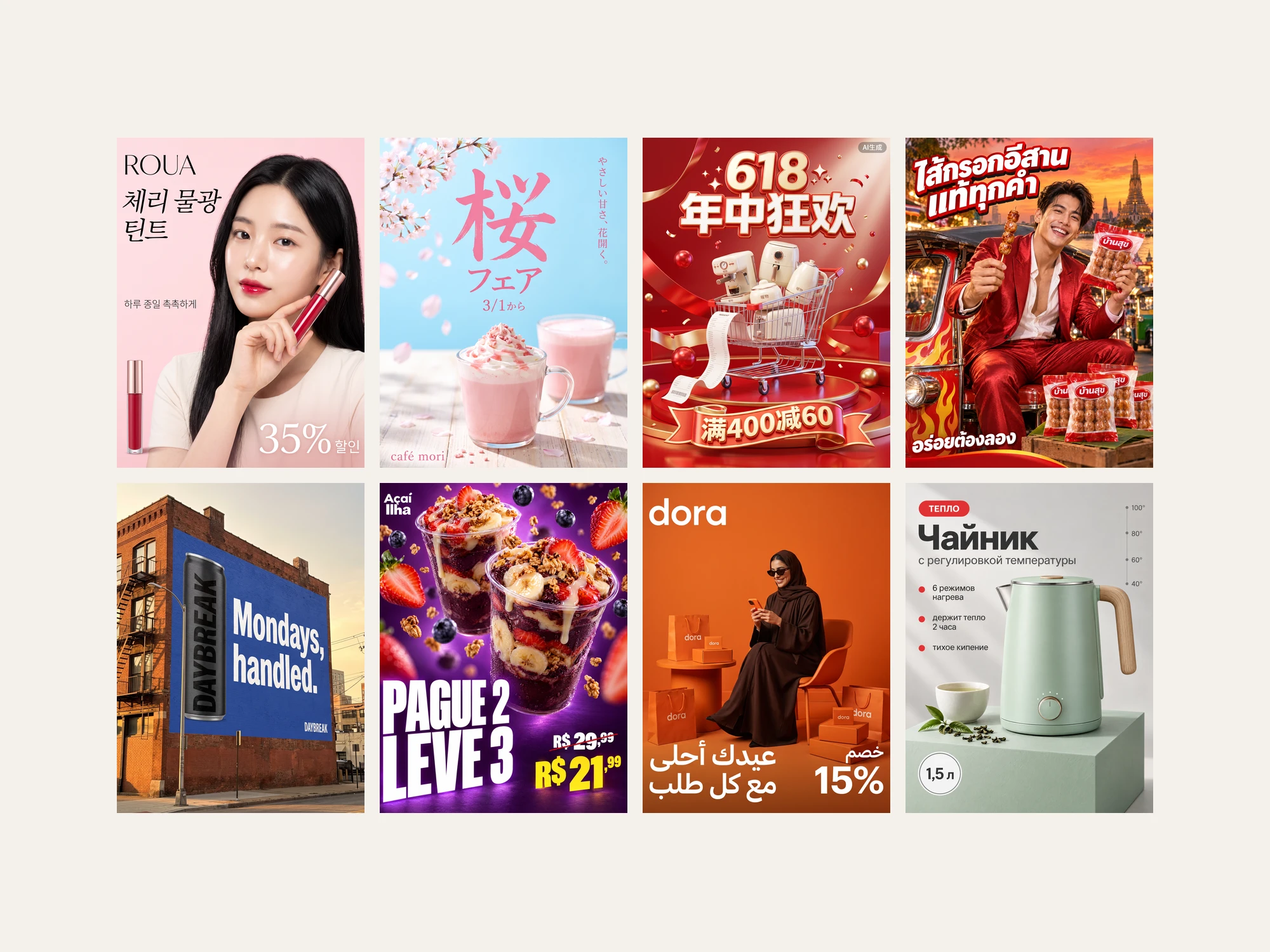
Key takeaways
- Korean brand ads are built around a star holding the product, and Korean studies put celebrities in 57 to 75 percent of TV ads.
- China's sale ads use glossy 3D stages and coupon numbers because its Advertising Law bans words such as best, and AI images there need a visible label since September 2025.
- American billboards are short and copy-led, a handful of words at most, while American social feeds are dense and text-heavy.
- Brazilian retail ads make the price the biggest type on the page, and Russian marketplace cards usually leave the price off the image.
- A market's look comes mostly from its platforms, sale calendar and ad rules, and Japan and China each also run a quiet second style for brand work.
On this page
- Four things designers believe, tested
- Brand ads and sale ads look different everywhere
- How the examples were made
- South Korea: the star holds the product
- Japan: the season is the headline
- China: the glossy 3D festival stage
- Thailand: loud, warm and star-led
- United States: one line on a billboard
- Brazil: the price is the headline
- Saudi Arabia and the Gulf: one color, one figure, Arabic first
- Russia: the product card that sells
- The quiet second style in Japan and China
- Eight styles side by side
- What shows up in every market
- Adapting one ad to a new market
- Make your own
- Frequently asked questions
Every market has an ad style you can spot from across the room. A Korean ad puts a star's face next to the product, and a Japanese café poster sets the season's word in huge type. A Chinese sale ad is a glossy 3D stage, and a Russian product card reads like a neat spec sheet. Below are eight countries, the style each one runs on, why it looks that way, and 30 example ads we made in that style with the full prompt for each.


Four things designers believe, tested
We started with four common beliefs about regional ad design and checked each one against platform rules, published studies and about 200 real ads we picked from several thousand Pinterest pins, market by market.
| The belief | What we found | Where it is actually true |
|---|---|---|
| Korean and Japanese ads make the product burst out of the frame | Partly true for Korea, not for Japan | Korea's anamorphic 3D billboards, such as the corner screen at COEX in Seoul |
| American ads are minimal and idea-first | True for billboards, false for social feeds | Premium outdoor: the iPhone 17 Pro posters showed only the product name |
| Russian ads are mostly product with almost no text | The product leads, but with a claim and callouts | Marketplace cards: one big product, one claim, three short facts |
| Brazilian ads glow | Mostly not | The constant in Brazilian retail is price as the biggest type; glow belongs more to China's 11.11 stages and Gulf Ramadan visuals |
Three of the four hold only for one kind of ad, and the fourth describes other regions better. The pattern behind all four is the same. A market's look comes less from "culture" in the abstract and more from the platforms it shops on, the calendar it sells around and the rules it advertises under. Culture tilts the style; platforms and laws lock it in.
Brand ads and sale ads look different everywhere
Each market runs two kinds of ads that can look almost opposite. The brand layer is the poster, the billboard, the key visual for a launch. The commerce layer is the sale banner, the marketplace image and the promo post. Text density follows the layer more than the country: a Japanese sale flyer and a Japanese brand poster often have less in common than a Japanese and a Brazilian sale flyer.
The sets below show the style each market is best known for, and every image in a set shares it while the product changes. Japan and China also get their quieter second style at the end.
How the examples were made
Every brand, product and person in these images is fictional, and every line of copy is written in the market's own language with an English gloss in the caption. Each image was made in October 2026 at 2K on Higgsfield, with Nano Banana 2.1 or GPT Image 2.5 Sunburst, the same models that run in ReelyArt Studio. We used GPT Image 2.5 for the text-heavy layouts in Thai, Portuguese and Cyrillic. The model is named above each prompt.
Each set started from one real ad style we picked from a board of references, and the prompts describe that style in words. No real ad was passed to a model. The SOLA can in the Japanese and American examples was generated once and attached to both prompts as a reference image.
South Korea: the star holds the product
A Korean brand ad is built around a face. A well-known model sits chest-up in soft, high-key light, looks straight at you and holds the product by the cheek or out toward the lens. The product is secondary in size, the headline is two short lines in Korean, and the logo sits in a clean corner. Korean studies compiled by The Grand Narrative put celebrities in 57 to 75 percent of TV ads.
Why it looks like this. A shared face signals that everyone already uses the product, and Korea's star system makes that face easy to book. Short 15-second spots leave room for a face and a name and little else.


Food ads keep the star and push the type harder: huge colored Korean letters around the person or across the dish, a saturated background and the food in close-up.

The one place the "burst out of the frame" belief holds is Korea's anamorphic 3D screens. The corner screen at COEX in Seoul, about 81 by 20 meters, is built for a box-shaped scene with one giant object pushing toward the street. d'strict's "WAVE" in 2020 and Samsung's folding-phone cat in 2023 both used it that way.

How to recognize it. A famous-looking face holding the product beside the cheek, pastel light, two short lines of Korean; or a giant product breaking out of a 3D box on a skyscraper.
The prompt for the lip tint ad at the top of the post (Nano Banana 2.1, 4:5):
Korean beauty brand key visual for a fictional lip tint brand "ROUA". An anonymous young Korean woman, early 20s, with long straight black hair, glass-skin makeup and glossy cherry-red lips, shot chest-up and slightly from above, looking straight into the camera. She holds a slim clear lip tint tube with cherry-red liquid and a rose-gold cap beside her cheek. Soft pastel pink background, bright high-key diffused beauty light, dewy skin highlights, editorial K-beauty retouching. Layout: the brand name "ROUA" in thin elegant serif at the top left; under it a two-line Korean headline in elegant script "체리 물광 틴트"; at the middle left a small Korean line "하루 종일 촉촉하게"; a second smaller tint tube standing at the bottom left; and at the bottom right a big "35%" with a small "할인" next to it in white. The face is the hero, the product is secondary. No other text, no logos.
The other four Korean prompts
Ginseng stick (Nano Banana 2.1, 3:4):
Korean health-drink advertisement in star-model style. An anonymous young Korean man, early 20s, soft wavy black hair, warm friendly smile, wearing a light blue striped shirt, leans toward the camera and stretches one arm out, holding a slim red ginseng stick pouch toward the lens with strong foreshortening, so the hand and pouch look huge and close. Warm beige studio background, soft even beauty light, clean retouching. The pouch is deep red with gold accents and the small brand "홍담" in white. Bottom left: a bold dark brown Korean headline in two lines "지친 오후엔" and "한 포 충전". Bottom right: the small brand "홍담" in dark red. The only text is the headline and 홍담. No other text, no logos.
Porridge (Nano Banana 2.1, 3:4):
Korean packaged-food advertisement in bold K-food style. Clean off-white background. In the centre, an anonymous handsome Korean man in his late 20s in a beige knit sweater smiles warmly at the camera, chest-up, holding a large ceramic bowl of steaming abalone rice porridge with a spoon lifted from it. Four gigantic bold Korean characters in bright leaf green, one in each corner of the poster around him, spell the headline: "든" top left, "든" top right, "하" bottom left, "다" bottom right. A few fresh ingredients fly around the bowl: abalone slices, a shrimp, chopped green onion and grains of rice, crisp and frozen in motion. Along the bottom, a green strip with three small porridge pouches printed only with "한그릇", and the brand "한그릇" in white at the right of the strip. Bright soft studio light, appetising, clean. The only text is 든, 든, 하, 다 and 한그릇. No other text, no logos. Each pouch shows only the word 한그릇 and a simple bowl illustration on plain colour; no subtitles, weights, ingredient lists or fine print on the pouches.
Then, as an edit of that image, to remove tiny unreadable print from the pouches:
Remove all the small lines of fine print and the small round seal at the bottom of each of the three pouches, and fill those areas with the same plain pouch colour. Keep everything else exactly as it is: the man, the bowl, the flying ingredients, the four green characters 든, 든, 하, 다, the word 한그릇 and the bowl illustration on each pouch, the green strip and the white 한그릇 on it.
Cheese tteokbokki (Nano Banana 2.1, 3:4):
Korean food delivery poster, loud and appetising. Bright sunshine-yellow background with a red-and-white checkered tablecloth along the bottom. Hero: a wide shallow pan of red tteokbokki rice cakes under a thick layer of melted stretchy cheese, a fork lifting a long cheese pull toward the camera, steam rising, glossy close-up food photography from a high angle. Top: a big bold Korean headline in red with a thick white outline and a dark red shadow, in two lines "치즈 폭탄" and "떡볶이". A small red starburst sticker at the top right reads "NEW". A small dark red badge at the bottom left reads "맵단". The only text is 치즈 폭탄, 떡볶이, NEW and 맵단. No other text, no logos.
3D billboard (Nano Banana 2.1, 3:4):
Photograph of an anamorphic 3D advertising screen on the corner of a modern glass tower in Gangnam, Seoul, on a clear afternoon, shot from street level across a wide plaza. The L-shaped curved LED corner screen shows a box-shaped room built like a traditional hanok pavilion with red lacquered columns, carved wooden eaves and a painted folding-screen backdrop of peonies. Out of this box a giant frosted-glass skincare serum bottle with a rose-gold dropper cap appears to burst forward and hang over the street in forced perspective, a few huge clear serum droplets and a ribbon of glossy liquid spilling out with it. The bottle is printed only with the small word "SEOA". The only other text on the screen is "SEOA" in clean white letters at the bottom of the box. A few pedestrians on the plaza look up, small for scale. Real photo, natural daylight, crisp detail. No phones, no animals, no real brand logos, no other readable text, no signage elsewhere, no marks or watermarks on the screen frame. The plaza and the ground floor have no banners, flags, kiosks, posters, shop signs or building names: only plain paving, a few trees, glass walls and people.
Then, as an edit of that image, to erase small leftover text on the bottle, the folding screen and the street:
Remove every bit of text except the two SEOA words: erase the small word and the fine print under SEOA on the bottle so the frosted glass is plain there; erase the calligraphy columns and red seals on the folding screen panels so only the painted peonies remain on plain paper; erase the signs, plates and small lettering on the ground-floor pillars and building fronts; erase the blue road signs and traffic signs on the street at the far right. Keep everything else exactly as it is: the tower, the screen, the hanok room, the bottle, the liquid and droplets, the large white SEOA at the bottom of the box, the SEOA on the bottle, the trees and the people.
Japan: the season is the headline
Japanese food and drink ads run on the calendar. Sakura in spring and kakigori shaved ice in summer each get their own palette. The season's word is set huge, in brush kanji or rounded kana, with the product under it in bright, shadowless light. Small badges such as 新 ("new") and 期間限定 ("limited time") do the selling. Next to the seasonal look, Showa-era retro (昭和レトロ) has become a style of its own: sunbursts, halftone dots and chunky hand-drawn katakana borrowed from 1960s posters.
Why it looks like this. Seasonality and gift-giving shape Japanese retail, so limited editions arrive with every season. Japanese has no capitals or italics, so emphasis comes from size, outlines and color, and a headline often mixes three type sizes.


The retro poster reads シュワッと爽快タイム, "fizzy, refreshing time." The same SOLA can appears on the American billboard further down.
How to recognize it. One season word set bigger than anything else, a bright pastel or sky-blue ground, and a 新 badge or a price in yen.
The prompt for the sakura fair poster (Nano Banana 2.1, 3:4):
Japanese café spring campaign poster, bright and seasonal. Clear sky-blue background, cherry blossom branches entering from the top left, soft pink petals drifting across the frame. A giant pink brush-written kanji "桜" fills the upper half, with the smaller pink word "フェア" under it. Lower half: a glass mug of pink sakura latte topped with whipped cream, pink sakura syrup and crunchy pink flakes, with a second cup behind it, fresh high-key food photography. A short vertical line of small pink Japanese text runs down the right side: "やさしい甘さ、花開く。". Small pink "3/1から" under the word フェア, and the small wordmark "café mori" at the bottom left. The only text is 桜, フェア, やさしい甘さ、花開く。, 3/1から and café mori. No other text, no logos.
The other Japanese prompts, and the SOLA can
Kakigori (Nano Banana 2.1, 3:4):
Japanese summer café poster for kakigori shaved ice, bright and cool. Aqua-blue background with scattered ice cubes and a soft gradient of light. Hero: a tall clear cup of fluffy shaved ice soaked in blue and green syrup, with lemon slices on top and a spoon straw, condensation on the cup, a big lemon wedge at the lower right, a few ice chips and syrup drops flying. Top: a huge playful headline "かき氷" in white with a thick blue outline, and a small green circle badge "新" beside it. A short white line above the headline: "ひんやり、レモン。". Bottom left: a round blue badge reading "500円". Top right: the small wordmark "kumo café". The only text is かき氷, 新, ひんやり、レモン。, 500円 and kumo café. No other text, no logos.
Showa-retro soda poster (Nano Banana 2.1, 3:4 with the SOLA can attached):
Japanese Showa-retro typographic poster with a screen-printed look. Deep teal background with coarse halftone dots and a slightly worn, faded paper texture. A huge jagged sunburst in sunshine yellow fills the centre. Over it, a giant chunky hand-drawn retro headline in red with a thick dark navy outline and an offset shadow, in three stacked lines: "シュワッと" on top, a much bigger "爽快" in the middle, and "タイム" at the bottom. The SOLA can from the reference image, exactly as it is, stands small at the lower right, cutting into the edge of the sunburst. Flat retro inks, slight misregistration, 1960s Japanese poster feel. The only text is シュワッと, 爽快, タイム and the words on the can. No other text, no logos.
The SOLA can, used as the reference image (Nano Banana 2.1, 1:1):
Studio packshot of a slim 355 ml aluminum can for SOLA, a fictional sparkling citrus soda. The can is a warm sunny yellow fading to tangerine orange at the bottom, with the wordmark "SOLA" in big rounded white letters running vertically up the can, a small flat white citrus-slice icon above it, and the small line "sparkling citrus" in white under the wordmark. Condensation droplets, crisp studio light, soft contact shadow, plain light grey background, front three-quarter view. Only the words SOLA and sparkling citrus, no other text, no barcode.
China: the glossy 3D festival stage
China's best-known sale style is the C4D key visual: a 3D stage in red or blue, products floating above a podium among ribbons, splashes and balloons, and coupon numbers in gold. It runs on a shopping calendar of its own, with 618 in June, 11.11 in November and smaller holiday sales in between.
Why it looks like this. The festival calendar produces a constant stream of key visuals, and the 3D stage became the template around 2017. Article 9 of China's Advertising Law bans words such as 最佳 ("best") and 最高级 ("highest grade"), so the copy uses numbers instead: discount thresholds, percentages, hours tested. Since September 1, 2025, AI-generated images also need a visible label, which is why each of these carries a small "AI生成" in the corner.


How to recognize it. A shiny 3D stage, a product floating in the air, a big sale date, and coupon thresholds where other markets would put a slogan.
The prompt for the 11.11 serum ad (Nano Banana 2.1, 3:4):
Chinese e-commerce festival key visual for 11.11, rendered in C4D style. A glossy deep ocean-blue and silver 3D stage: a round podium with a wave of clear water curling around it, floating translucent spheres and silk ribbons. Two frosted glass serum bottles with silver caps for the fictional skincare brand "澜境" float above the podium at dynamic angles, with water splashing around them. Huge glossy silver-and-gold numerals "11.11" behind the bottles. Headline at the top in bold white Chinese: "水光精华 狂欢价". Under it a smaller line: "3重玻尿酸 · 72小时保湿实测". At the bottom a gold coupon strip with two coupons: "满300减50" and "满500减100". In the top right corner a small grey label "AI生成". Saturated, polished, glossy reflections and soft glow, premium festival mood without red. No real platform logos, no other text.
The other two Chinese sale prompts
618 cart (Nano Banana 2.1, 3:4):
Chinese e-commerce festival key visual in C4D 3D style for a fictional small-appliance brand "暖物". A glossy red stage with curved red ribbons and floating red spheres. In the centre, a chrome shopping cart overflowing with cute cream-white small kitchen appliances: a coffee machine, an air fryer, a kettle and a toaster, all printed only with "暖物"; a long paper receipt curls out of the cart. Top: a big white bold headline "618 年中狂欢". Lower area: a gold coupon ribbon with "满400减60". Top right corner: a small grey label "AI生成". Bright studio light, high gloss, rich red. The only text is 618 年中狂欢, 满400减60, 暖物 and AI生成. No other text, no platform logos.
May Day storefront (Nano Banana 2.1, 3:4):
Chinese holiday sale key visual in C4D 3D style for a fictional earbuds brand "星屿". A clean bright blue sky background. In the centre, a toy-like miniature 3D storefront diorama with glass walls, filled with tiny earbuds cases and cute round blue mascots; on the roof, giant inflatable glossy blue balloon numerals "5.1". Small floating clouds and confetti. The storefront sign reads "星屿". Top: a bold white headline "五一 出游季". Top right corner: a small grey label "AI生成". Soft studio light, pastel blues and white, playful and premium. The only text is 5.1, 五一 出游季, 星屿 and AI生成. No other text, no logos.
Thailand: loud, warm and star-led
The Thai consumer ads we collected share one energy: a grinning presenter, saturated warm color and food or drink held right up to the camera. The Thai headline is fat, with a thick outline and a shadow. Thailand is also famous for emotional long-form films and absurd comedy, but the product posters we found run on this louder register.
Why it looks like this. Southeast Asian e-commerce leans heavily on local stars and K-pop ambassadors, and Thai script, with its stacked vowels and tone marks, holds up well set large and outlined.


How to recognize it. A presenter mid-laugh, flames, steam or splashes, and a Thai headline outlined like a sticker.
The prompt for the sausage ad (GPT Image 2.5, 3:4):
Thai packaged-food advertisement, portrait, loud and joyful. Warm orange-to-red sunset sky over a softly blurred Bangkok street. An anonymous handsome Thai man in his late 20s, wearing a shiny red suit and an open white shirt, sits on a red tuk-tuk painted with yellow and orange flame decals; he grins at the camera, holding up a wooden skewer of grilled Isan sausage balls in one hand and a sealed sausage pack in the other. The pack is red and white, with the brand "บ้านสุข" in bold white Thai letters on a red badge. Top left: a huge bold Thai headline in white with a thick red outline and a dark shadow: "ไส้กรอกอีสาน แท้ทุกคำ". Bottom left: a smaller white Thai line "อร่อยต้องลอง". Bottom right: three more sausage packs stacked. Saturated colour, glossy commercial light, energetic diagonal composition. The only text is the two Thai lines and บ้านสุข. No other text, no logos.
The other two Thai prompts
Honey lemon tea (GPT Image 2.5 Sunburst, 3:4):
Thai bottled-tea advertisement, loud and bright. A saturated sunshine-yellow paper background is torn open in the middle, and an anonymous handsome young Thai man in his 20s, in a white T-shirt, bursts through the tear, grinning and holding up a clear bottle of honey lemon green tea with a green label printed only with "ไร่ชา". Lemon slices, honey drops and green tea leaves fly around him. Bottom: a big bold Thai headline in dark green with a white outline "ชาเขียวน้ำผึ้งมะนาว", and under it a smaller dark green line "หวานน้อย". Top right: the brand "ไร่ชา" in a green badge. Glossy commercial light, energetic. The only text is the two Thai lines and ไร่ชา. No other text, no logos.
Restaurant combo (GPT Image 2.5 Sunburst, 3:4):
Thai restaurant promotion poster, loud and appetising. Sage-green background with a subtle Thai pattern. Two generous combo plates as heroes: stir-fried holy basil pork with jasmine rice and a crispy fried egg, and green curry chicken with rice, each with a glass of Thai iced tea; steam and glossy food photography. Top: a big bold Thai headline in white with a thick dark green outline "อิ่มอร่อย". Next to each plate, a big red price badge: "129.-" and "159.-". Two small red starbursts reading "ฟรี!" next to the iced teas. Top right: the restaurant brand "ครัวบ้านนา" in a dark green badge. Saturated, cheerful, busy but tidy. The only text is อิ่มอร่อย, 129.-, 159.-, ฟรี! and ครัวบ้านนา. No other text, no logos.
United States: one line on a billboard
American outdoor advertising is copy-led and short. One witty line, big type, a product or nothing at all, and a small logo in the corner. When Apple put up its iPhone 17 Pro posters, they carried the product name and no tagline.
Why it looks like this. A driver reads a billboard in a few seconds, and a low-context audience expects the ad to say its point outright. The same country's social feeds look nothing like this: they are dense, scrappy and full of comparison charts and review cards. The minimal look belongs to the billboard.


How to recognize it. A handful of words, set big, with one joke or one number carrying the whole ad.
The prompt for the digital billboard (Nano Banana 2.1, 16:9, with the SOLA can attached):
Close, low-angle photograph of a large roadside digital billboard against a bright blue summer sky with soft clouds; the billboard fills about 80 percent of the frame, its right end slightly cropped, the steel pole visible below. The LED face is a flat tangerine orange with visible pixel texture. On the left, the SOLA can from the reference image, exactly as it is, big and tilted, partly cropped by the left edge. In the middle, a black rectangular dot-matrix LED panel showing "97°" in glowing orange-white dots, followed by bold white sans-serif copy on two lines: "reasons to" and "crack one open.". At the lower right of the board, a small white wordmark "SOLA". A touch of sun glare, real photo. The only text is 97°, reasons to, crack one open., SOLA and the words on the can. No other text, no operator logos, no other brands.
The other three American prompts
Type-only billboard (Nano Banana 2.1, 4:5):
Photograph of a large roadside billboard shot from below against a moody grey-blue sky, the board filling most of the frame. The billboard is all type: a flat black background with huge white condensed sans-serif copy on three lines, "Your alarm called.", "We let it go", "to voicemail.". At the lower right, a small white wordmark "LULL" with the small line "mattresses". No pictures on the board, nothing else. Real photo, slight perspective, steel structure and catwalk visible. The only text is the three lines, LULL and mattresses. No other text, no operator logos.
Wall billboard (Nano Banana 2.1, 3:4):
Photograph of a large painted wall billboard on the side of an old red-brick building in a US city at golden hour, shot from the street at an angle. The billboard has a flat cobalt-blue background; on the left a tall matte black can of cold brew coffee printed only with "DAYBREAK", big; on the right, huge white bold sans-serif copy on two lines "Mondays," and "handled.". Small white wordmark "DAYBREAK" at the lower right. Warm low sun on the bricks, a fire escape and a street lamp in the foreground for scale. The only text is Mondays, handled. and DAYBREAK. No other text, no other brands. The street lamp and the fire escape stand clear of the billboard copy: nothing covers or crosses any letter of Mondays, handled.
Sale poster (GPT Image 2.5 Sunburst, 4:5):
Bold American sale poster for a fictional sneaker brand "KESTREL". Flat neon-yellow background. A gigantic black "40" fills most of the poster, and a sharp black-and-white photo of a running sneaker is visible through the inside of the numerals like a window. A smaller black "%" and "OFF" sit to the right of the numerals. Top left: small black "BLACK FRIDAY". Bottom left: small black "SITEWIDE". Bottom right: small black "NOV 27–30". Top right: the black wordmark "KESTREL". Strict grid, huge type, no other decoration. The only text is 40, %, OFF, BLACK FRIDAY, SITEWIDE, NOV 27–30 and KESTREL. No other text, no logos.
Brazil: the price is the headline
Brazil's commerce style puts the price in the biggest type on the page: a small "R$", a huge number, the cents as a superscript and the old price struck through above it. Food and produce float on saturated color, and the headline is condensed, heavy and white. Many Brazilian supermarkets still employ sign painters to letter their daily offers by hand, and the same price-first hierarchy carries over to the posts made on a phone.
Why it looks like this. Brazilian retail grew up on weekly supermarket circulars, and promotions get names of their own, like a weekly produce day. Payment matters on the image too: Pix, the instant payment system, made up about 47 percent of Brazilian financial transactions by the end of 2024, so "pay with Pix" badges are common. Brazil was also Cannes Lions' first Creative Country of the Year in 2025, and its award work is a different, hand-made world.


The violet glow behind the açaí showed up often in the Brazilian food posts we collected. Across the rest of Brazilian retail the light is flat and bright, and the price does the shouting.
How to recognize it. The price is bigger than the product name, with a superscript cents figure and a struck-through old price.
The prompt for the açaí post (GPT Image 2.5, 4:5):
Brazilian Instagram promo post for a fictional açaí shop "Açaí Ilha". Rich purple background with a soft violet glow and subtle depth. Two clear plastic cups of thick purple açaí bowl, topped with sliced strawberries, banana coins, granola and a drizzle of condensed milk, float at different heights in the upper half; a few strawberries, blueberries and granola clusters fly around them, crisp studio food photography with high gloss. Top left: the small white wordmark "Açaí Ilha". Lower left: a huge white condensed headline in two lines "PAGUE 2" and "LEVE 3". Lower right: the old price "R$ 29,99" in white with a diagonal strike-through, and under it the new price "R$ 21,99" big in yellow with the cents as small superscript. Bold, appetising, scroll-stopping. The only text is Açaí Ilha, PAGUE 2, LEVE 3, R$ 29,99 and R$ 21,99. No other text, no logos.
The other two Brazilian prompts
Burger post (GPT Image 2.5 Sunburst, 4:5):
Brazilian food-delivery Instagram post for a fictional burger shop "BRASA BURGER". Saturated orange background with darker orange halftone texture. Centre: a huge double cheeseburger with melting cheddar, crispy bacon and glossy bun, cheese dripping, sesame seeds flying, crisp studio food photography. Top: a giant white condensed headline "FOME DE QUÊ?". Left side: a dark badge "NO APP" with the price "R$ 32,90" in white with a strike-through. Right side: a yellow badge "NO SITE" with the price "R$ 24,90" huge in dark brown with the cents as small superscript. A bold white "VS" between them. Bottom centre: the small wordmark "BRASA BURGER". Loud, appetising, scroll-stopping. The only text is FOME DE QUÊ?, NO APP, R$ 32,90, NO SITE, R$ 24,90, VS and BRASA BURGER. No other text, no logos.
Produce post (GPT Image 2.5 Sunburst, 4:5):
Brazilian produce-market Instagram post for a fictional greengrocer "HORTI BOM". Bright lime-yellow background with soft green leaf shapes. Top: a huge chunky 3D headline "QUARTA VERDE" in white with a thick green outline and a soft shadow. Three hero fruits floating with crisp studio photography: a ripe mango, half a papaya with seeds, and a pineapple. Next to each, a green price tag with the price in big white numbers and the cents as small superscript: "R$ 4,99 kg", "R$ 6,49 kg" and "R$ 3,99 un". Bottom centre: the wordmark "HORTI BOM" in dark green. Fresh, saturated, cheerful. The only text is QUARTA VERDE, the three prices and HORTI BOM. No other text, no logos.
Saudi Arabia and the Gulf: one color, one figure, Arabic first
The Gulf references we kept coming back to share a monochrome set: everything in one saturated color, with a single modestly dressed woman as the hero. The product is in her hands, and a large Arabic headline, often calligraphic, reads right to left. Ramadan is the peak advertising season, and the palette shifts with it.
Why it looks like this. Saudi media rules published in 2025 require modest clothing in media content and ban displays of wealth, so the drama comes from color and light. Arabic leads, English follows if it appears at all, and the headline is often the largest shape on the page after the figure.


How to recognize it. One color from floor to wall, one elegant figure, and a large Arabic headline.
The prompt for the Eid delivery ad (Nano Banana 2.1, 4:5):
Gulf delivery-app advertisement for Eid, portrait, a bold monochrome orange set. Everything is the same saturated orange: the backdrop, a round side table and a modern chair. An anonymous young Gulf Arab woman sits on the chair wearing a dark chocolate-brown abaya and a matching hijab, with black sunglasses; she smiles and looks at her phone, which has a bright orange case. Around her, orange paper shopping bags and orange delivery boxes, all printed only with the lowercase white wordmark "dora". Soft studio light, clean shadows, fashion-editorial mood. Bottom left: a white Arabic headline in two lines, correctly connected and reading right to left: "عيدك أحلى" and "مع كل طلب". Bottom right: "خصم" in white with a large white "15%" under it. Top left: the white wordmark "dora". The only text is the Arabic headline, خصم, 15% and dora. No other text, no other logos, no flags.
The other two Gulf prompts
Perfume (Nano Banana 2.1, 4:5):
Gulf luxury perfume advertisement on a monochrome deep red set. Behind, heavy red velvet theatre curtains with soft folds; dramatic warm spotlight. An anonymous young Emirati woman in a deep red hijab, elegant makeup, looks calmly at the camera and holds a faceted red crystal perfume bottle with a gold cap close to her face; the bottle is engraved only with "RUWAN". Left side: a white Arabic headline in elegant calligraphic type, stacked in two lines, correctly connected and reading right to left: "عطرٌ" and "يُشبهكِ". Bottom left: the small white wordmark "RUWAN". Rich, cinematic, editorial. The only text is عطرٌ يُشبهكِ and RUWAN. No other text, no logos, no flags.
Ramadan lantern (Nano Banana 2.1, 4:5):
Gulf home-decor brand Ramadan advertisement on a monochrome warm terracotta-orange set. A tall arched niche shape in a slightly darker orange frames the scene, with the white Arabic calligraphy "رمضان كريم" inside the top of the arch, correctly connected and reading right to left, and a small white crescent and star above it. An anonymous young Gulf woman in a soft beige hijab and abaya smiles gently and holds up a glowing brass lantern with warm candlelight; a second lantern hangs beside her. Top left: the white wordmark "دار". Soft warm studio light, calm and festive. The only text is رمضان كريم and دار. No other text, no logos, no flags.
Russia: the product card that sells
Russia's working ad format is the marketplace card: a tall 3:4 image with one big product on a pale or single-color ground. It carries one bold Cyrillic headline, two or three short facts with small icons, and a round badge for the size. The product leads, though less than the "90 percent product" belief suggests; practitioner layouts leave room for the claim and the callouts.
Why it looks like this. A large share of Russian online shopping runs through marketplaces such as Wildberries and Ozon, so the card is the ad many shoppers actually see. The price usually stays off the image because the marketplace prints it next to it. A language law in force since March 2026 also requires consumer-facing text to be in Russian first.


How to recognize it. A tall card, one product, one Cyrillic headline, three neat lines of facts and no price.
The prompt for the kettle card at the top of the post (GPT Image 2.5, 3:4):
Russian marketplace product card, portrait, clean premium design. Pale warm-grey background with a soft gradient and a subtle shadow. Hero: a modern pastel mint electric kettle with a smooth cylindrical stainless-steel body, a light oak wooden handle and a small round temperature dial at the base; it stands on a solid mint cube pedestal, with a few loose green tea leaves and a small white ceramic cup beside it. It is an original design, not a retro kettle. Top left: a small red rounded pill with the white word "ТЕПЛО". Under it, a big dark headline "Чайник" and a smaller grey line "с регулировкой температуры". On the left, three short lines, each with a small red dot icon: "6 режимов нагрева", "держит тепло 2 часа" and "тихое кипение". Bottom left: a white circle badge with a thin grey border reading "1,5 л". On the right edge, a thin vertical temperature scale with "40°", "60°", "80°" and "100°". Crisp studio light, plenty of air, precise alignment. The only text is the strings listed. No other text, no logos.
The other three Russian prompts
Berry drink card (GPT Image 2.5 Sunburst, 3:4):
Russian marketplace product card, portrait, premium clean design. Pale warm-grey background with a soft gradient. A gigantic light-grey Cyrillic word "МОРС" fills the top third behind the product. Hero: a tall clear glass bottle of deep red cranberry drink with a white label printed only with "ТАЙГА" and "клюквенный", with fresh cranberries and a sprig of leaves scattered at its base, crisp studio light, glossy reflections. On the left, two short lines, each with a small red rounded icon: "без добавления сахара" and "из северных ягод". Bottom right: a white circle badge with a thin grey border reading "1 л". Plenty of air, precise alignment. The only text is the strings listed. No other text, no logos.
Vitamin card (GPT Image 2.5 Sunburst, 3:4):
Russian marketplace product card, portrait, premium clean design. Soft violet background with a few large abstract rounded shapes in lighter lilac. Hero: a white supplement jar with a sunny yellow label printed only with "СЕВЕР" and "D3", tilted slightly, with a few soft gel capsules beside it; crisp studio light. Top left: a big white headline "Витамин D3" and under it a smaller white line "2000 МЕ в капсуле". On the left, two short white lines, each with a small yellow dot icon: "90 капсул" and "1 капсула в день". Bottom right: a small white rounded badge reading "на 3 месяца". Precise grid, plenty of air. The only text is the strings listed. No other text, no logos.
Drill card (GPT Image 2.5 Sunburst, 3:4):
Russian marketplace product card, portrait, bold premium design on a dark graphite background with subtle diagonal light streaks. Hero: a burnt-orange and graphite-grey cordless drill held in a black work glove, shot dynamically at an angle, with a spare battery pack below it; the drill is printed only with "ГРАНИТ" and "18V". Top right: a big burnt-orange headline in two lines "Дрель-" and "шуруповёрт". On the left, three white spec callouts with small burnt-orange icons: "18 В", "45 Н·м" and "2 АКБ в комплекте". Bottom right: a burnt-orange rounded badge reading "кейс в подарок". Crisp, punchy, high contrast. No yellow anywhere on the tool or the batteries. The torque collar and chuck are plain ribbed black with no numbers, marks or scales. The only text is the strings listed. No other text, no logos.
The quiet second style in Japan and China
Japan and China each run a second style that looks like the opposite of the first. Japan's premium posters use ma, empty space: a pale photograph, a small product, one vertical line of type. MUJI's "Horizon" campaign and JR Central's "そうだ 京都、行こう。" ("That's it, let's go to Kyoto") are the classic examples. China's newer "New Chinese" style, 新中式, is equally quiet: ink-wash landscapes, a small product, vertical type and a seal.


Both are as authentic as the loud styles above. The difference is the layer: the quiet posters sell a brand, and the loud ones sell this week's offer.
The prompts for these two posters
Japanese ma poster (Nano Banana 2.1, 3:4):
Minimal Japanese brand poster for fictional wireless earbuds "KAZE". About 75 percent of the canvas is calm empty space: a pale morning sky fading into soft white mist over a flat, still sea, with a faint horizon line low in the frame. In the lower right corner, small, a matte white earbud charging case sits open on a pale stone with both earbuds visible. One vertical line of Japanese copy in a delicate Mincho typeface runs down the upper right: "音のない朝を、持ち歩く。". At the bottom left, three short lines of small grey body text in Japanese, and at the bottom right the small wordmark "KAZE". Soft, even, shadowless light, low contrast, muted cool palette, lots of breathing room, editorial print poster. No other text.
Then, as an edit of that image, to remove three lines of body text that came out garbled:
Remove the three lines of small grey text at the bottom left completely and fill the area with the same plain off-white paper texture. Keep everything else exactly as it is: the photo, the vertical line 音のない朝を、持ち歩く。, the earbuds and the KAZE wordmark.
New Chinese tea poster (Nano Banana 2.1, 3:4):
New Chinese style (新中式) poster for a fictional oolong tea brand "山雾". Off-white rice-paper background with a faint ink-wash mountain range dissolving into mist across the lower half, and a single thin branch with a few small autumn leaves reaching in from the left edge. In the lower centre, small, a matte celadon-green tea tin with a tiny red seal stamp sits on a plain stone. Large vertical Chinese characters in elegant calligraphic brush style at the upper right: "秋分", with a thin vertical line under them and a smaller vertical line "一盏山雾 · 半日闲". A small red square seal mark next to the characters. At the bottom left the small wordmark "山雾". Generous negative space, quiet, muted palette of off-white, ink grey, celadon and one touch of red. No other text.
Eight styles side by side
| Market | Hero | People | Type | Color | Price |
|---|---|---|---|---|---|
| South Korea | A star holding the product | Celebrity-style model | Two short Korean lines | Soft pastels | Small flag, such as 35% off |
| Japan | The season and the product | Often none in food ads | One huge season word | Sky blue, sakura pink, retro teal | Small yen badge |
| China | A floating product on a 3D stage | Rarely | Sale date and coupons | Red and gold, or bright blue | Spend-and-save thresholds |
| Thailand | A presenter with the product | Local star | Fat outlined Thai | Warm and saturated | Red badges |
| United States | One line of copy | Rarely | Big sans, a handful of words | Flat brand color | A single number |
| Brazil | The price | Rarely | Condensed white headline | Saturated backgrounds | Biggest type on the page |
| Gulf | One figure on a one-color set | A modestly dressed woman | Arabic calligraphy, right to left | One color throughout | Short percentage |
| Russia | The product | None | One Cyrillic headline and callouts | Pale or single color | Usually off the image |
What shows up in every market
- Sale numbers as design. 618, 11.11, 12.12 and Black Friday are typeset as hero graphics everywhere they run.
- The floating product. China's 3D stages, Korea's 3D billboards and the Gulf's heritage dioramas all lift the product out of its scene.
- A face next to the product. Strongest in Korea and Thailand, common in Japanese TV ads, rare in day-to-day American ads.
- Local script as decoration. Outlined Thai, mixed-size Japanese, calligraphic Arabic and condensed Cyrillic all carry the look as much as the photo does.
Adapting one ad to a new market
- Script and direction. Write the headline in the market's language first. Arabic runs right to left and needs its letters connected; Russia requires Russian first.
- Claims. China, Japan, Korea and Russia penalize unproven superlatives such as "best" or "No. 1". Use a number instead.
- Casting. Gulf ads need modest clothing in media content. Korea expects a face; the US is comfortable without one.
- Calendar. Plan around the market's own sale dates and holidays: 618 and 11.11 in China, Ramadan and Eid in the Gulf, double-date sales in Southeast Asia.
- Platform. Marketplace images follow the marketplace's rules. Rakuten, for example, has limited text on the first product image to 20 percent since 2018.
- Price display. Big and struck through in Brazil, as a coupon threshold in China, and usually off the image on Russian marketplaces. Saudi sale ads must show the license and the before and after prices.
Make your own
Every prompt above can be pasted into ReelyArt Studio with the model named above it. Swap the brand, the product and the copy, keep the description of light, layout and type, and the style stays. For a fictional or real brand of your own, attach the logo and product as reference images; the brand kit guide shows how to keep them consistent across a set like these.
All brands, products and people in these images are fictional. Real campaigns and companies are named in the text only, and their names are trademarks of their owners.